Most of those countries have some sort of universal healthcare - some do have a blended system where there is private insurance in addition to the public one.
I apologize for the tangent, but it's my experience as a 70 year old that conceptually being a purist is the simplest, and therefore to minimalists like me, most appealing. BUT !!
Unfortunately or not, bitter experience has taught me in practice, blended systems tend to work best. Conceptually it's half-stepping. But for the efficiency-minded pragmatist, it can't be beat.
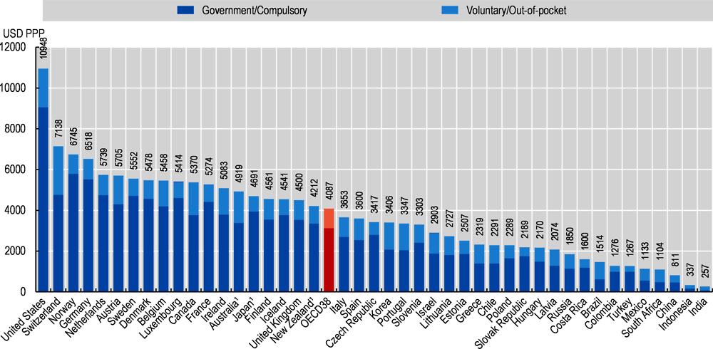
As for cost just look north of the border - per capita healthcare costs in Canada are roughly half of what they are in the US and everyone is covered
SOURCE (with detailed discussion)
You've got me over a statistics barrel here S2.
Is there a time component missing here? The Z-axis perhaps? I followed the link, and found this, adjacent to the graph:
Figure 7.4. Health expenditure per capita, 2019 (or nearest year)
?!
The Y-Axis is "USD PPP"
That's U.S. $Dollars per patient person ?
Per year?!
I may be a worthless hulk. But I don't cost $10K / year in healthcare.
Lifetime? Probably more.
Anyway, I'm sure that's significant data, relevant, elucidating stats.
But I can't make sense of it, beyond the conspicuous: the U.S. is at the long end of the non-alphabetical list.
I also don't know what OECD38 is, but it's a flashy color, a stand-out.